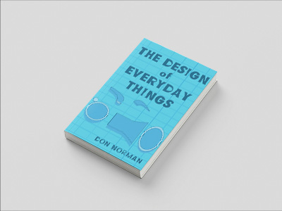
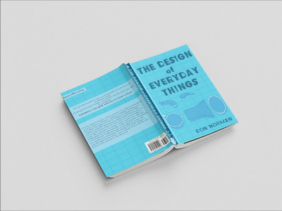
A redesign of the book “The Design of Everyday Things” by Don Norman. The Design of Everyday Things is a timeless exploration of how thoughtful design shapes the way we interact with the world around us. For its redesign, I reimagined the book’s approach to simplicity and and the overall idea of deconstructing things to their simplest forms to influence changes. This redesign features a, minimalist cover that focuses on the idea of deconstruction, breaking down the teapot featured in the original cover. Drawing inspiration from the book’s themes, I focused on clean lines, simple shapes, intuitive typography, and the feel of schematics. Overall, I focused on elements that echo the principles of human-centered design.
Design Prompt
“Redesign a book of your choosing and manipulate the text in a way that fits the theme. “
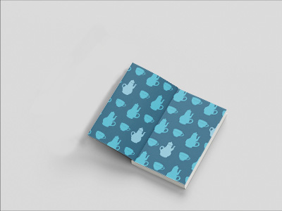
The main ideas that were being followed at first were the ideas of simplicity and scale of elements in the design. While making iterations I found that the best way to get across the ideas reflected in within the book was through the color usage of blue because of the color’s technological implications and adjusting the typography to be more geometric. While the original cover design focused on design errors, I focused on breaking down the main subject of the first cover and adding to the end pages the tea cups and how the designs play into each other.